Building a visual style part 1.
-2017.6.14 4:00pm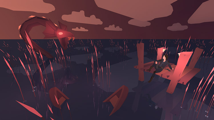
I'm going to talk about a project I'd like to continue working on sometime. By that, I mean it's a project that I've abandoned, and while I hope I'll get back to it someday, I likely never will. Which is a bit sad. It was cool.
In this post, I'll tell you about how this project came to be! Then I'll show you a bit about the process I used to figure out the visual feel of the game, and a bunch of gifs. Then later in another post, I'll show you some shaders and visual effects! I love shaders.
'Shooter' origins.
Back when VR first became available to consumers, I was playing a lot of Space Pirate Trainer. It's fantastic. One of my favorite VR games, and quite a workout too! Only, I felt there were a lot of additional elements that I would really love to see in the game, like a much deeper weapon system, something I could explore around in a bit.
So I got started on a version of my own to see if I could pull it off! I designed a gun, made some pretty VFX, set the player in an atmospheric, moody whitebox level, and showed it to a few people. It was pretty simple, nothing terribly new, but it was received well and showed me that I was on the right track.


Like any good project code-named 'shooter' I started with guns.

...and explosions.
I sat back down, and opened up the scope a little more. What would the game look like, how would it feel? What colors would be in it, what sort of environments would the player be in, and what sort of enemies might they find there? What was the lore of the land?
I spent a lot of time playing my demo. I took it as a good sign.
Concept.
Adding lore to an arcade style game can be a tricky feat. The surface of the game comes from a very shallow source, and most of the lore will never show up explicitly in the game either. But threads of it will show up throughout everything in the game, so it's still important. I never settled on a solid story, unfortunately, but I knew what I wanted the game to feel like, so I focused on that.


Mood boards! It's like concept art, but free, and better than you can do yourself!
These mood boards led to 4 different environment designs. Ultimately, the player would be able to play in each one of the 4 locations, but you have to start somewhere, so I settled down with one of them, and started sketching some ideas.


Thumbnails. They're all the same. I'm not good at thumbnails.
I got a very specific image stuck in my head very early on, so I started chasing it down wholeheartedly. The image contains most of the elements important to composing a whole environment, and lets me begin working towards an objective right away. So I began drawing the individual elements, and making assets for them.


Drawing stuff before modeling -really- helps me create better stuff!
The environment was open, extremely sparse, and would allow me to do initial development in mostly ideal conditions. The platform served the purpose of being an excellent place for VR players to stand, though that might later become complicated with variable sized play-spaces.


Rawr.


I really liked the emissive stuff in my shaders, so I made sure my dude glows :)
With a little more lore, this could have been a much more interesting creature, but it would work to start with. I also had no idea how I was going to do AI for it, but that wasn't an obstacle yet, so I didn't worry about it! Plenty of opportunity to create other enemies later. I never did get far enough to do the AI, so it was never an obstacle.


My character was a dude before I saw the Rogue One trailer. Jyn is pretty cool lookin'.


Modeling and iterating in VR is amazing, so much easier to get proportions right!
The character was the last thing I added. I'm not a great artist, and humanoids are pretty tricky for me. Fortunately, this gave me a bit of extra time to think about who would be shooting stuff and why. I ended up with a fairly 'Han Solo' sort of character, and was pretty happy with that for the moment. This was around the time when the first Rogue One trailer came out, so there was certainly a bit of inspiration there.
Transition to print.
Unfortunately, this is where I started running out of time. Full time jobs are no snooze-fests, and other things just took priority. So I changed the scope of the project to something a little more reasonable, see if I could get something finished out of it. I decided to take the scene I had been working on, and turn it into a lenticular 'animated' print!
Lenticular prints are the pictures with the cool '3D' effect to them. You can often find them on postcards or bookmarks in gift shops, or the rare advertisement! They have little ridges that show a different column of color based on where your eyes are. My thought was that instead of displaying stereo images for 3D, I could play an animation with those color slices instead!
I had already designed my animations to loop at the same fixed increments, so it was a trivial matter to fit the scene into a short animated loop and send it off for test prints. Lenticular prints are not particularly cheap at large sizes, and it's not something I had done before. I definitely needed test prints to make sure I was even on the right track. It took a few weeks, but eventually I had a pair of postcard sized previews.
Motion wasn't super visible, and resolution was a bit low.
There were a lot of problem points! Too much motion in some areas, too little motion in others. Significant issues with contrast and brightness as well. Part of it was from being a physical medium, another part was because I had fresh eyes from waiting so long for the prints to come back. Lenticular prints also don't quite behave as much like an animation as I had hoped. I need another set of test prints before I can make an attempt at a large final one.
Okay, what then?
So that's where I left it! Perhaps I'll pick it back up again sometime, either as a lenticular print, or even as a game. The game itself is bigger than a week, so I may not get to anything of quite that scope for a while. But the print might make for a nice in-between project when I'm looking for a break.
Either way, the shaders and techniques that I developed for this project are still some of my favorites! I constantly reference and reuse them when making new projects. So even though the project hasn't gone much of anywhere yet, I've still gotten a lot of good material from it.
Next post, I'll be digging into the technical details of the style. The texturing, the procedural animation, the lighting equations and shader architecture! Keep your eyes peeled, and let me know if you've got any questions!


